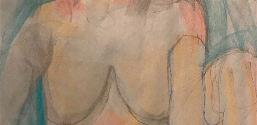

Graphite and Soft Pastel Chalk on Charcoal Paper
This was a fun one, although I’ll have to admit, not at first, lol. I’m having a tendency to lay out the initial drawing with a wide base. This made the model appear wider on paper. We were able to fix this and place the torso in a box frame.
My challenges began with laying out the proportions, seeing the relationships among darker and light areas.
With my instructors help, she first corrected the torso, and then laid out the colors for me so that I can see the relationships in a different way.
I’m excited about this piece because we introduced color that helped me see the background, and of the light and darks on the subject. Also, my intention this year is of my confidence in painting. Focusing on the foundations has been really helpful so far.
I found that I’ve developed a stylized contour-ish line in my drawings. It was relieving to actually erase those lines in favour of getting the proportions down right. (I got lost in detailing the model’s front leg, it turned out that the leg was just too small and I decided to correct it. Erased it and started that part over.)